
typography thoughts
+5
maree - AD
Shamus - Production Manag
ameliahb-editor.
michaela - SM
Admin
9 posters
Page 1 of 1

typography thoughts
![]() Admin Thu Mar 13, 2008 2:03 am
Admin Thu Mar 13, 2008 2:03 am
please start posting any ideas or images you would like to share.
here are a few links julia gave us in class have a look if your stuck for ideas.
www.typeculture.com
www.typotheque.com
www.typographi.com
www.designobserver.com
www.p22.com
www.emigre.com
www.designwalker.com
here are a few links julia gave us in class have a look if your stuck for ideas.
www.typeculture.com
www.typotheque.com
www.typographi.com
www.designobserver.com
www.p22.com
www.emigre.com
www.designwalker.com
Admin- Admin
- Posts : 13
Join date : 2008-03-12 -

Typeface
![]() Admin Thu Mar 13, 2008 3:53 am
Admin Thu Mar 13, 2008 3:53 am
There's one called "Graphik" on this site => http://typographica.org/
I like how it's simple and easy to read.
From Kat
I like how it's simple and easy to read.
From Kat
Admin- Admin
- Posts : 13
Join date : 2008-03-12 -
Dear FAMILY
![]() Admin Thu Mar 13, 2008 4:01 am
Admin Thu Mar 13, 2008 4:01 am
Ok... everyone is going to vote TONIGHT, for the article typeface.
DON'T FORGET~ hohoho!
From Kat
DON'T FORGET~ hohoho!
From Kat
Admin- Admin
- Posts : 13
Join date : 2008-03-12 -
Re: typography thoughts
![]() michaela - SM Thu Mar 13, 2008 4:21 am
michaela - SM Thu Mar 13, 2008 4:21 am
these are a few fonts i think would look good...
 georgia
 gill sans
 lane narrow
georgia gill sans lane narrow
michaela - SM- Posts : 26
Join date : 2008-03-13
Age : 40
Location : central coast
ameliahb-editor.- Posts : 4
Join date : 2008-03-13
my vote
![]() michaela - SM Thu Mar 13, 2008 6:12 am
michaela - SM Thu Mar 13, 2008 6:12 am
yeah i second that, gill sans is my fav.
i really like lane narrow also, so either is ok for my vote.
cheers mic.
i really like lane narrow also, so either is ok for my vote.
cheers mic.
michaela - SM- Posts : 26
Join date : 2008-03-13
Age : 40
Location : central coast
caps
![]() Shamus - Production Manag Thu Mar 13, 2008 11:31 am
Shamus - Production Manag Thu Mar 13, 2008 11:31 am
just a suggestion,
it doesnt go with normal conventions, but what if we print in small caps?
Its a bit different...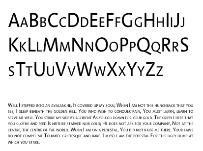
it doesnt go with normal conventions, but what if we print in small caps?
Its a bit different...

Shamus - Production Manag- Posts : 14
Join date : 2008-03-13
my two cents
![]() maree - AD Thu Mar 13, 2008 1:28 pm
maree - AD Thu Mar 13, 2008 1:28 pm
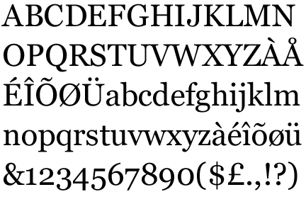
well, i am in love with lane narrow but it doesnt come in bold italic etc so that might be a problem.
I like gill sans, id probably prefer gill sans light tho.
I like gill sans, id probably prefer gill sans light tho.

maree - AD- Posts : 34
Join date : 2008-03-13
Typeface Conciderations
![]() Serryn - Design Thu Mar 13, 2008 1:30 pm
Serryn - Design Thu Mar 13, 2008 1:30 pm
Hi guys,
Just thought I'd post up a few considerations I think might be of interest when selecting a typeface:
- The selection of Fonts, as far as I know is restricted to those available in the Linotype Gold Collection, and are available for download over the network in the BJ computer labs (or at least this is my understanding). You can download a PDF of the collection in the bottom left of the page at: http://www.linotype.com/1783/linotypegoldedition171.html. When I say restricted you still can choose from 3000+ fonts, so you shouldn't feel too restricted
- We have decided on a Sans Serif typeface in class for the body copy, so please keep this in mind when selecting your font.
- We need to arrive at a consensus for a desirable text point and leading size. As a general rule auto leading is around 120% of the type pt, where as magazine lead hight is roughly 150% of the type pt i.e 12pt/18pt.
- Take into account range of weights and styles available when selecting your in your proposed font.
If you guys can think of anything that needs adding post it up!
Cheers,
Serryn - Head Designer.
P.S. Studio manager's: is it possible to get some sort of voting thingy in the forum we can use for typeface votes?

Serryn - Design- Posts : 25
Join date : 2008-03-13
Re: typography thoughts
![]() Serryn - Design Thu Mar 13, 2008 1:47 pm
Serryn - Design Thu Mar 13, 2008 1:47 pm
Shamus - Production Manag wrote:just a suggestion,
it doesn't go with normal conventions, but what if we print in small caps?
Its a bit different...
Hey Sham, what is this typeface called?
Serryn - Design- Posts : 25
Join date : 2008-03-13
Linotype Aroma .. Sorry
![]() Shamus - Production Manag Thu Mar 13, 2008 2:43 pm
Shamus - Production Manag Thu Mar 13, 2008 2:43 pm
Linotype Aroma
Its from the gold library
Its from the gold library
Shamus - Production Manag- Posts : 14
Join date : 2008-03-13
Typefaces.....more.
![]() John Thu Mar 13, 2008 6:17 pm
John Thu Mar 13, 2008 6:17 pm
Hey guys & gals,
Here's a link with more typefaces for professional design.
http://www.smashingmagazine.com/2007/08/08/80-beautiful-fonts-typefaces-for-professional-design/
I like Myriad Pro. To me its like the balance between style and readability. The typeface is also readily available (it comes with the adobe CS3 programs).
I also kind of like Lisboa (typeface no.15 from the link). But I don't know if the curves are too much. Getting a hold of this typeface will also be a challenge as I don't know of any place where its available free for download.
Anyway this is just my 2 cents worth.
Out of the three typefaces: Georgia, gill sans & lane narrow, I vote for Gill Sans. Gill Sans for the win!
wishing everyone a good weekend,
John
John- Posts : 1
Join date : 2008-03-13
Re: typography thoughts
![]() Bek - Editor Fri Mar 14, 2008 8:49 am
Bek - Editor Fri Mar 14, 2008 8:49 am
Editor - Rebecca
Hey everyone
I looked up a couple of the websites that were posted on type, this one:
www.emigre.com, was really good, I suggest looking at it for everyones choices in the typography for their headings and even www.typographi.com was quite good (or so I thought!)
But yeah gill sans or lane narrow seem like really good choices for our main type!

Bek - Editor- Posts : 20
Join date : 2008-03-14
Location : Normanhurst
Re: typography thoughts
![]() Camilla - designer Fri Mar 14, 2008 1:33 pm
Camilla - designer Fri Mar 14, 2008 1:33 pm
Although I like both Lane Narrow and Gill Sans I think Lane Narrow might become a bit hard to read with large portions of text.
Milla
Milla
Camilla - designer- Posts : 16
Join date : 2008-03-14
Age : 36
Location : Potts Point
Typography - (Body) Type Test
![]() Serryn - Design Sun Mar 16, 2008 1:22 pm
Serryn - Design Sun Mar 16, 2008 1:22 pm
Hi Guys,
Judging by the total number of votes in the type poll, I think it's safe to say not everyone has voted (myself included). But I have excuse - well kind of. While noodling around in my Top Secret Research Lab (T.S.R.L) I've done up a little body type experiment based on the following typefaces:
Gill Sans MT / Myriad Pro - Regular / Univers 45 Light / Helvetica Neue 55 Roman.
My conclusion: Univers 45 Light 9 / 12. Looks good to me, I feel its a good balance between text / space, Not too heavy, not too light.
Although I don't mind Gill Sans MT 9 / 12 - But its a little heaver on the page.
If anyone is interested I'm happy to forward a PDF copy so you can print it out and judge for yourself - Just email or PM me.
Cheers, Serryn.
samplmag@tpg.com.au
Serryn - Design- Posts : 25
Join date : 2008-03-13
Page 1 of 1
Permissions in this forum:
You cannot reply to topics in this forum|
|
|